KFC Rebrand
PERSONAL PROSPECTIVE PROJECT
fast food brand re-imagination
I began working on this idea after thinking about restaurant "face-lifts" and some of the success stories including, Taco Bell, Wendy's, and a local Charleston favorite, Melvin's. I looked through the aforementioned branding shifts and pin-pointed what made the re-designs successful. Chick-fil-A is the current market leader. KFC follows with 1/4 of revenue, per individual store. In order to compete and increase market share I designed a new work mark logo, brand assets, packaging, and a sample of restaurant applications.


Branding
original palette
I decided to stylize the name as "Kentucky Fried Chicken" versus the now shortened "KFC". I think the full-length name suits the altered brand identity. I want the branding to use simple textures to highlight the southern-comfort style cooking with fresh ingredients.
KFC maintains a loyal customer base and this re-design aims to attract new consumers while also not alienating current ones. I am not re-inventing their menu or changing how the restaurant generally operates. Prices will remain the same, this is strictly a brand "face-lift". I want to revive the experience of long-time and first-time customers. The brand experience needs to be elevated and refreshed. The food should be allowed to stand alone and maintain what made the chain famous.
I expanded the current color palette. The two grey tones and slightly deepened red accent shades add depth and create new pairing options.The logo is represented in word mark form. The main script typeface is paired with a bold sans-serif for a simple, personal, and clean appearance. The script infuses the logo with the "hand-crafted" style that flows through the rest of the brand.
name
logo iterations
general concept
color palette
new palette


Additional brand assets
iconographic logo
common imagery

Accompanying the logo are a few brand assets used to accessorize many applications. The most commonly used is two versions of an ink-stamp stylized chicken. The full chicken and just the head are used in the packaging and restaurant decor. The imagery is also used as part of a pattern I created for use on packaging.
Packaging design
food packaging
advertising assets
The packaging features many textures that are meant to reinforce the southern roots of the brand and the new brand identity. These textures include butcher's paper, metal, bleached wood, and red plaid. All packaging is made out of recycled paper, and can be recycled. The iconic chicken bucket is stylized to resemble a distressed-metal bucket. The drink carrier and meal boxes are designed to appear as wooden milk crates. This storytelling packaging will encourage consumers to take pictures of the unique pieces and share on social media.


restaurant design
branding application
The restaurant exterior and interior design incorporate similar features of the packaging, while also extending the texture palette. The exterior sign is an enlarged neon version of the main logo. A large metal raised sign, in the shape of the chicken head, will be found on the drive-thru side of the building.
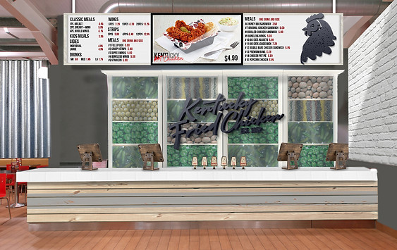
When customers walk in, their attention will be directed to the ordering counter. The wooden counter is topped with white-tiles, with wooden iPad registers and a fountain soda tap.
Behind the counter are glass covered, styled shelves. The openings contain various produce and spices relating to main menu items. A metal version of the logo sits on-top. This blocks the kitchen from view and creates a curated experience. A vintage style, letter board style menu will change above the counter . The screen in the middle rotates images of the food and specials, while the names and pricing information are shown on either side.
The interior will also feature a "wicker-wall" in the dining area , where customers can take photos.